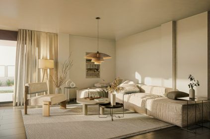
It’s a well established psychological fact that color influences emotions, behaviors, and wellbeing in ways that extend beyond aesthetic appeal, to the point where this is an integral part of many industries, from interior design to film-making. A shining example of how this knowledge is applied in interior design is the work done by CBB Design in Morganton, North Carolina, where understanding the psychological impact of color forms a core element of their creative approach. Their expertise includes applying established color psychology principles to create environments that support their clients’ mental and emotional health.
Psychological Foundations of Color
Color psychology examines how different hues affect mental and emotional states, and its findings often shape how colors are used in interior design. For example, blues are widely recognized for promoting calmness and tranquility, making them ideal for spaces meant for relaxation, such as bedrooms. Yellows tend to remind us of the sun, making it a great way to uplift your mood and boost energy, which makes them perfect for kitchens or creative studios. Greens are known for reducing eye strain and fostering concentration, being excellent for workspaces or study areas. However, individual responses to color are not universal—they’re shaped by cultural backgrounds, personal experiences, and even memories. A shade that feels soothing to one person might evoke discomfort in another due to personal associations. Skilled designers ,like those at CBB, account for these nuances, selecting hues that resonate with occupants to create spaces that feel both functional and deeply personal.
For example, specific shades of blue and green can lower stress levels, as supported by studies showing their calming effects on the nervous system. In contrast, warm yellows or soft neutrals can counteract seasonal affective changes, particularly in regions with long, dark winters. These choices are grounded in research that links color to emotional and cognitive responses, ensuring spaces align with their intended emotional impact.
Enhancing Function with Color Contrast
Color contrast is a practical tool for improving a space’s usability. By using distinct hues to highlight key elements like doorways, light switches, or workstations, CBB makes spaces more intuitive and accessible. This approach also reduces visual fatigue, as clear differentiation helps the eye navigate effortlessly through the environment. For the elderly, higher contrast between functional elements can also address common vision changes, such as reduced color perception, making spaces more user-friendly. Saturation adds another layer to this technique: vibrant, high-saturation colors energize creative or active spaces, while softer, muted tones create a calming atmosphere in areas designed for reflection or rest.
Personalizing Spaces Through Color
Personalization is at the heart of good design. Therefore, by identifying colors tied to positive memories or meaningful experiences, CBB’s designers craft spaces that resonate emotionally with their occupants. For someone who associates a particular shade of coral with joyful childhood summers, incorporating that hue into a living space can evoke warmth and nostalgia. For individuals navigating significant life transitions, such as a move or career change, carefully chosen colors can provide a sense of stability and belonging, blending aesthetic appeal with emotional functionality. This tailored approach ensures spaces feel uniquely personal, fostering a deeper connection to the environment.
Measurable Benefits
The impact of color-focused design is evident in real-world outcomes. Feedback from occupants of thoughtfully designed spaces highlights benefits like improved sleep quality, reduced stress levels, elevated mood, and increased energy. These results stem from applying color psychology principles with precision, tailoring hues to individual needs and room functions. By creating environments that actively support wellbeing, designers demonstrate the tangible power of color to transform both spaces and lives.
To discover how experts like CBB Design leverage color psychology to create transformative interiors, visit cbbdesignfirm.com or explore their portfolio on Instagram @cbbdesignfirm.
Last modified: August 7, 2025


